
Digital accessibility content review is a practical pre-publication process for checking whether web content can be perceived, understood and used by people with different access needs. This guide keeps editorial checks, implementation checks and formal conformance claims separate.
What a digital accessibility content review is
A digital accessibility content review is a structured check of the words, images, headings, links, media, forms and publishing choices that shape how people find, understand and use a page. It is narrower than a full product accessibility evaluation and broader than running an automated scanner. The reviewer asks whether the content communicates its purpose, preserves meaningful structure, supplies useful alternatives for non-text material, and gives people enough information to complete the task.
The phrase “content review” should not be used as a promise of legal compliance. WCAG 2.2 provides success criteria and supporting guidance, while local accessibility obligations depend on the organization, audience, technology and jurisdiction [1]. A responsible review records what was checked, what was observed, which guidance informed the finding, and what still needs specialist or user validation. That record is more useful than a badge, score or unsupported declaration.
Start with audience, purpose and task
Before opening a checklist, write down who the page serves, what task the person is trying to complete, and what information they need to make a decision. A service page, an article, a form confirmation and a pricing comparison have different content risks. The same sentence may be sufficient in one context and confusing in another because the surrounding task changes its meaning.
W3C cognitive accessibility guidance emphasizes clear purpose, findability, understandable structure and support for completing tasks [2]. Use that principle as the first editorial gate. If a reviewer cannot explain the page’s purpose in one plain sentence, the page may need an information-architecture revision before individual alt text or link labels can be judged. Record the intended audience and task in the review sheet so a second reviewer can understand the decision.
Map the page before checking individual elements
Create a quick inventory of the page before editing it. Note the title, introduction, headings, lists, tables, images, diagrams, audio or video, forms, calls to action, downloads and repeated navigation. Then identify which elements carry meaning and which are decorative or redundant. This inventory prevents a common failure: fixing visible fragments while missing the relationship between the fragments.
A page map also makes review effort proportional. A short announcement may need a title, language, image alternative and link check. A long guide may require a section outline, table interpretation, media transcript, form review and a manual keyboard pass. The objective is not to force every page into an identical template. The objective is to make the review boundary visible and reproducible.
Use WCAG as a source boundary, not a score chase
WCAG 2.2 organizes guidance around perceivable, operable, understandable and robust principles [1]. Those principles help a content team connect editorial decisions to accessibility requirements. For example, a meaningful image raises a text-alternative question; a heading structure raises an information-and-relationships question; an interactive call to action raises name, role, focus and keyboard questions.
Do not turn the number of passing checks into a claim that the page is accessible to everyone. Automated tools can find some programmatic signals, but they cannot judge every contextual alternative, whether a heading communicates the section, whether a transcript is complete for the task, or whether a process is understandable. Mark automated findings as signals and manual findings as observations. Keep unresolved questions visible rather than converting uncertainty into a green status.
Review titles, language and page purpose
The page title should describe the page’s subject or task without relying on visual styling alone. Check the document language and confirm that the opening content uses the same vocabulary as the title, navigation label and search result promise. A clever headline may attract attention but still leave a reader unsure what the page offers or whether they reached the right destination.
Plain language does not mean removing necessary technical terms. It means introducing specialized words, explaining abbreviations at first use, and avoiding avoidable ambiguity. W3C’s cognitive guidance recommends clear words, familiar hierarchy and understandable instructions [2]. Read the page aloud, inspect the first screen without images, and ask someone unfamiliar with the project to summarize its purpose. If the summary differs from the intended task, revise the content before optimizing secondary details.
Check heading hierarchy and meaningful sequence
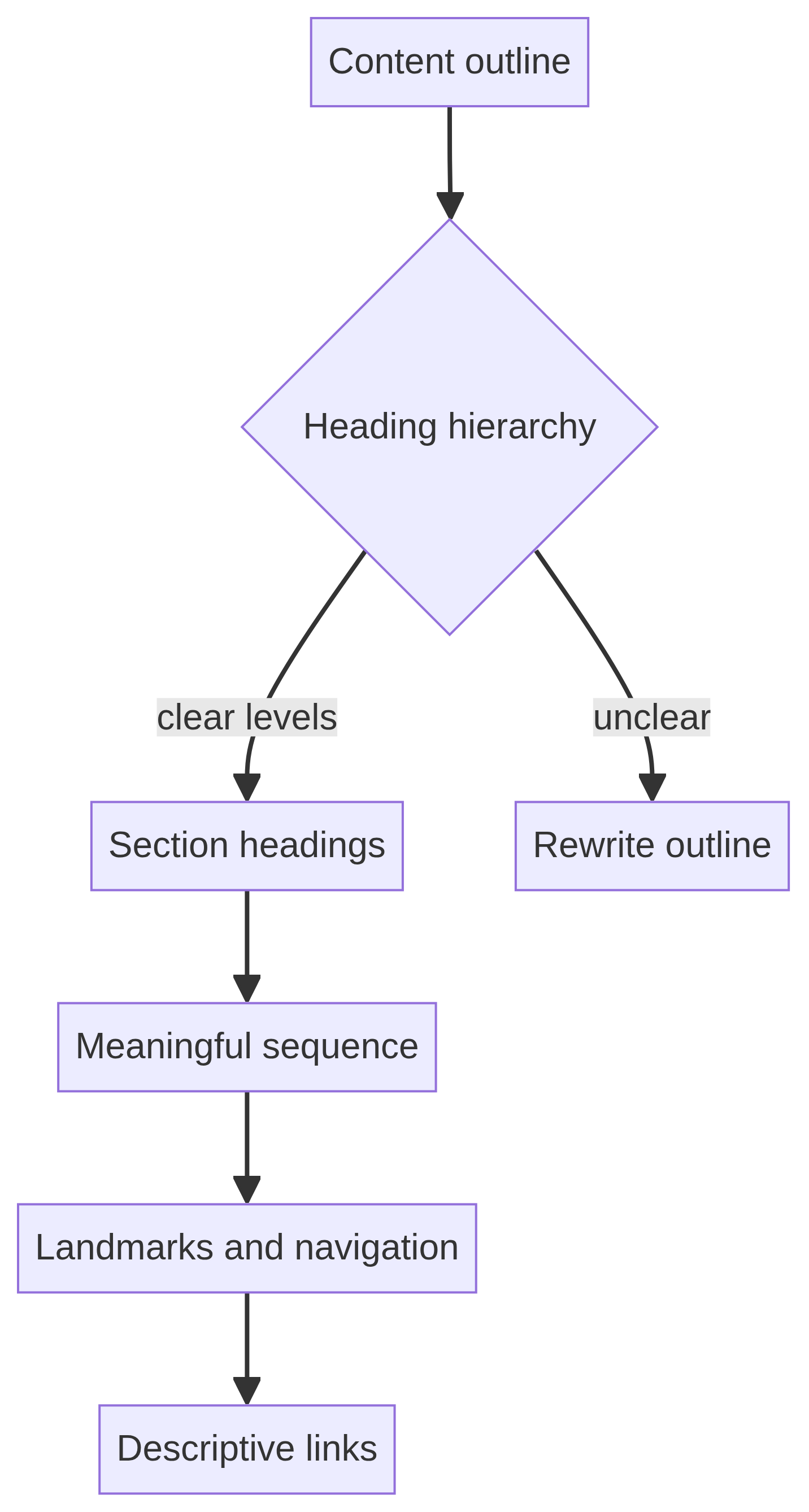
Headings should describe sections and form a meaningful outline. Review the sequence in the markup, not only the visual size. A page can look polished while using headings as decoration, skipping levels without a reason, or placing important instructions after the control they explain. WCAG includes criteria related to information and relationships, meaningful sequence, and headings and labels [1].
Export the outline or list the headings in order. Ask whether each heading answers a reader’s “where am I?” question and whether the next paragraph belongs under it. Keep one clear page-level heading where appropriate, then use lower levels for nested sections. Lists should be marked as lists, tables should have discernible headers, and visual separators should not carry the only meaning. Figure 2 summarizes this review path.
Make links understandable out of context
A link label should tell a person where it goes or what action it performs. Labels such as “click here,” “learn more” or repeated “read more” links force a reader to reconstruct meaning from nearby visual context. The exact wording depends on the page, but the destination or action should remain understandable when links are listed together.
Review the link text in the page outline and in a screen-reader-style links list if available. Check that visually hidden labels do not create contradictory names, that the same destination uses consistent wording, and that downloads identify their format when that information matters. Link clarity is also good information architecture: it helps search engines and users understand relationships without implying that accessibility by itself determines search visibility.
Give meaningful images an equivalent purpose
For each image, ask what job it performs in the sentence or task. If it conveys information, the alternative should communicate the equivalent purpose rather than merely naming the object. If it is decorative, redundant or a background treatment, it should be implemented so assistive technology can ignore it where appropriate. WCAG 2.2’s Non-text Content criterion describes these distinctions and exceptions [1].
Write alternative text in context, not from a filename. A chart may need a short summary beside it and a longer explanation when the data is essential. A button image needs a name that describes the action. A logo used as a home link needs an appropriate accessible name. Figure 3 shows the decision path for visual and media alternatives. Do not add keyword-stuffed alt text; it can obscure the actual purpose and reduce clarity.

Handle diagrams, charts and dense visuals
A diagram can be attractive yet inaccessible if its relationships exist only in color, position or tiny labels. Provide the main conclusion in nearby text, describe the relevant relationships, and ensure that the same task can be completed without zooming into a raster image. If a figure is merely a visual summary, the surrounding paragraph may be enough; if it is the evidence itself, the data or a structured equivalent must remain available.
Check color-independent meaning, labels, legends, axes and reading order. Avoid placing essential text inside an image when ordinary HTML text would work. For a complex process map, give the process as an ordered list as well as a visual. The review should explain why the alternative is sufficient for the intended task, not simply state that an alt attribute exists.
Review video, audio and animated media
Media review begins with identification: what information is delivered through sound, speech, motion or timing? A caption file may cover spoken words but omit meaningful non-speech audio. A transcript may help people who cannot hear the media, but it may need descriptions of visual actions when those actions carry the message. A short animated illustration may need a nearby explanation even when it has no audio.
Check whether controls are named, whether motion can be paused when needed, and whether the content remains understandable if autoplay is blocked or the media fails. Break long media into chapters or provide a clear summary so people can find the relevant section. W3C’s accessibility guidance treats time-based media separately from ordinary images [1]. Record which alternatives were reviewed and whether the reviewer checked the actual media, not only its thumbnail.
Use clear language without flattening expertise
Readable content is easier to navigate when sentences have a clear subject, instructions use consistent verbs, and paragraphs do one job at a time. Replace unexplained jargon with a familiar term or define it on first use. Prefer concrete instructions such as “Choose a service area” over vague prompts such as “Get started with your journey,” unless the metaphor is explained by the surrounding task.
Clear language does not require a single reading-level target or a simplistic tone. Preserve necessary technical accuracy, show examples, and use tables or step lists when relationships are easier to scan than prose. Cognitive accessibility guidance highlights clear words, simple tense and voice, visual presentation and predictable structure [2]. Ask a reviewer who did not write the page to complete the intended task using only the published instructions.
Check contrast, text spacing and reflow handoffs
An editorial reviewer should inspect whether text, controls, icons and meaningful graphics remain distinguishable against their backgrounds. WCAG 2.2 includes criteria for contrast, text resizing, reflow, text spacing and non-text contrast [1]. Some checks require browser inspection or design-system knowledge rather than copy editing, so record a handoff when the content team cannot verify the implementation.
Resize text, increase spacing where the environment allows, and narrow the viewport. Look for clipped labels, overlapping content, hidden instructions, horizontal scrolling and buttons whose meaning depends on color. A page may need a developer fix even when the copy is correct. Keep the finding attached to the specific component and URL. Do not mark the content review complete simply because a color-contrast tool returned no errors.
Make forms and instructions task-complete
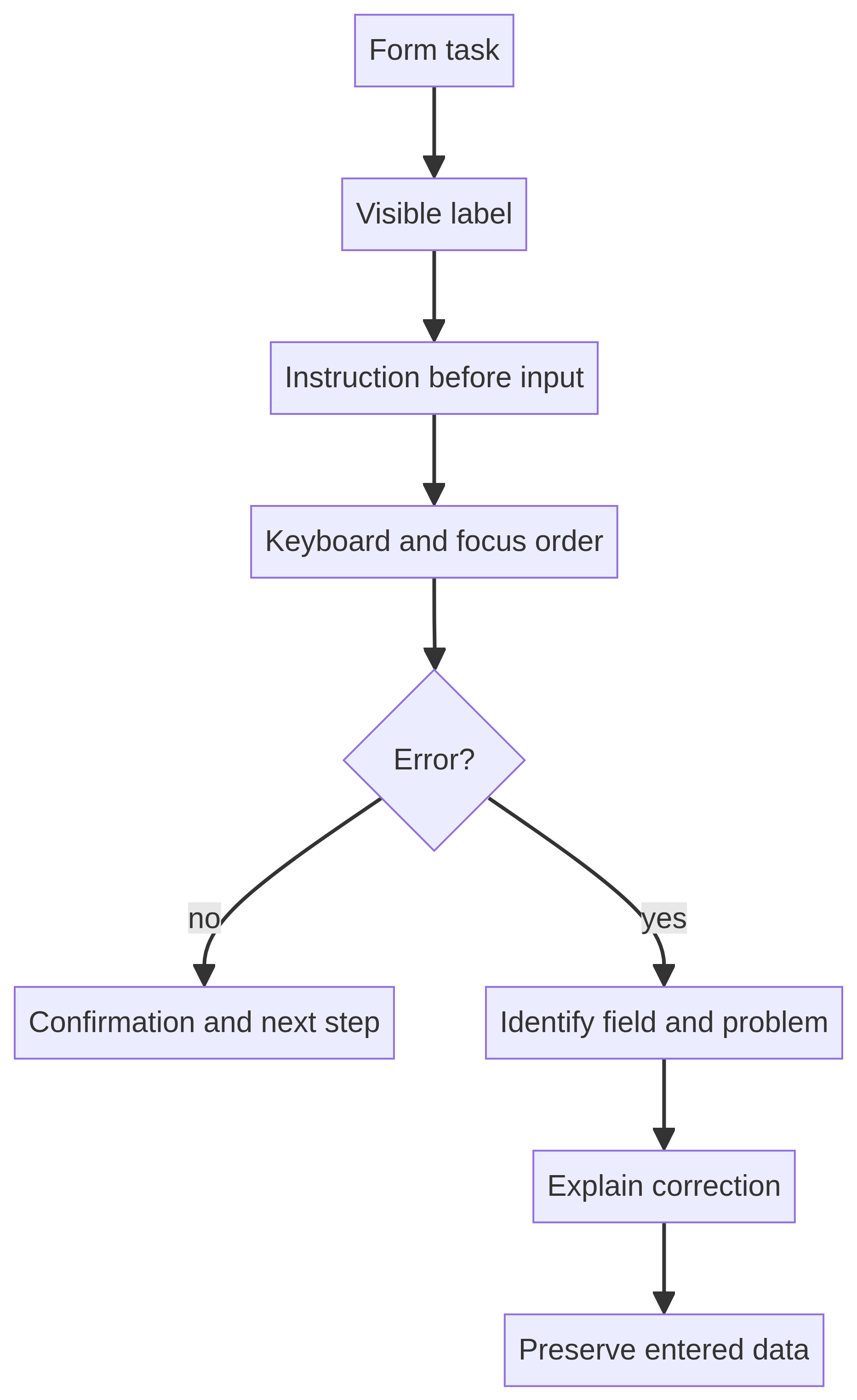
A form review asks whether a person can identify each field, understand what belongs in it, submit it, and recover from a mistake. Check visible labels, instructions, required status, input purpose, accepted formats, examples, focus order and confirmation language. The instruction should appear close enough to the control that the relationship is clear without relying on memory.
Test an intentional error. Does the message identify the field, explain the problem, preserve entered data where possible, and tell the person how to correct it? W3C guidance includes criteria related to error identification, labels and instructions [1]. Figure 4 models this path. Include the error state in screenshots or notes; a review of only the successful path is incomplete.
Review focus, keyboard and target interactions
Content teams may not own JavaScript, but they should still test the basic interaction contract. Use the keyboard to move through links, menus, accordions, carousels, forms and dialogs. Check whether focus is visible, whether the reading or action order is sensible, and whether the user can escape a component. WCAG 2.2 includes keyboard, focus visibility, focus not obscured and target-size criteria [1].
On touch screens, inspect whether controls are large enough and separated from neighboring targets. Do not solve small targets by adding invisible padding that changes the accessible name or makes the control ambiguous. Record the browser, viewport, input method and component state. If the content makes an action sound available but the control cannot be reached or operated, treat that as a content-and-implementation defect requiring an owner.
Keep navigation and repeated components consistent
People use repeated headers, breadcrumbs, sidebars and calls to action as orientation points. Check that labels stay consistent across the page, that the current location is identifiable, and that a user can move to related content without relying on browser history. A page should offer a predictable route back to the parent topic and a clear next step without trapping the reader in a promotional loop.
Consistency does not mean every page must have the same density. A long article may benefit from a contents list, while a short confirmation page may need only a primary action and support contact. W3C cognitive guidance recommends familiar hierarchy, consistent visual design and clear navigation [2]. Review navigation on mobile as well as desktop because collapsed menus and sticky controls can change the task sequence.
Make tables, lists and downloads understandable
Use a list when items are a list, a table when the reader must compare relationships, and ordinary paragraphs when neither structure is needed. Check that table headers identify the relevant row or column and that the table remains understandable when read linearly. If a table is too wide or complex for the task, provide a summary or a simpler alternative rather than relying on horizontal scrolling alone.
Downloads need descriptive names, useful link labels and, where relevant, a format or size indication. Check that the document itself has a meaningful title, language, headings, reading order and accessible tables. A web page cannot make an inaccessible PDF accessible merely by adding a better link label. Record the handoff to the document owner and keep the review boundary explicit.
Treat personalization and authentication as content concerns
Instructions often fail when they assume people will remember a previous step, recognize an unfamiliar icon or copy a code without assistance. Review authentication and multi-step content for clear directions, error recovery, time limits, and a way to regain context. W3C cognitive guidance discusses reducing reliance on memory and supporting accessible authentication [2].
Avoid unnecessary instructions that depend on color, shape, position or a particular device. If a person must choose among options, state the criteria in words. If an action expires, explain what will happen and how to restart. These are not promises that every authentication system is accessible; they are review questions that help editors identify where content and product behavior need coordinated attention.
Separate automated findings from manual evidence
Run an automated check when it is useful, but preserve the tool name, date, URL and rule version in the evidence record. A tool result is a signal about the tested page and state; it is not a universal verdict about the site. Automated checks may miss context, alternative-text quality, logical order, understandable language, complete captions and whether a user can finish the task.
Pair tool output with manual inspection. Open the page with images unavailable, read the headings and links in order, operate the keyboard path, test a form error, and inspect the narrow viewport. If the page has a complex chart or a downloadable document, review those assets directly. Section508.gov points authors toward WCAG quick references, sufficient techniques and common failures [3]. Use those resources to investigate findings rather than to inflate a score.
Create a finding that another person can act on
A useful finding contains the URL, component or text, observed behavior, user impact, relevant criterion or guidance, severity rationale, owner, proposed correction and retest result. Quote only the necessary text and avoid placing private data in a shared evidence package. Use a neutral description: “The error message says ‘invalid’ but does not identify which field or how to correct it” is more actionable than “form is bad.”
Severity should reflect the task blocked or made difficult, not the emotional tone of the reviewer. A missing alternative for a decorative image may be low priority; a missing alternative for the only instructions in a diagram may be more significant. Figure 5 shows a complete finding lifecycle. Keep “needs more evidence” separate from “fixed,” and do not close a finding because a developer changed code without a retest.

Use a repeatable editorial sign-off workflow
A practical sign-off has five stages. First, scope the page, audience, task and assets. Second, inspect content and implementation signals. Third, record findings with evidence and owners. Fourth, retest the corrected state. Fifth, publish the review record with its limitations and next review date. This order prevents a team from treating a draft screenshot as proof of the final page.
For recurring publishing, add the review to the editorial calendar and define a trigger: new template, new media, major copy revision, new form, translation, campaign landing page or accessibility issue report. Keep a lightweight version history so later reviewers can see whether a change was intentional. The best workflow is not the longest checklist; it is the one that produces a clear decision and makes unresolved work visible.
Connect accessibility review with SEO without making ranking claims
Accessible content and SEO can share useful practices: descriptive titles, meaningful headings, clear link labels, text alternatives, crawlable HTML and understandable page structure. These overlaps make a page easier for people and machines to interpret, but the relationship must be described carefully. An accessibility improvement does not promise a ranking outcome, and a page that performs in Search is not automatically accessible.
Keep the two review lenses distinct. Ask the accessibility question—can people with different access needs perceive, understand and operate the content? Ask the SEO question—can the page be discovered, indexed and matched to a relevant query? Then record the evidence for each. Do not add accessibility language to metadata as a marketing claim, and do not use “WCAG compliant” unless an appropriately scoped evaluation supports that statement.
Build a pre-publication worksheet
A worksheet can be short while still being specific. Include the page URL and version, reviewer, date, audience, task, title, language, heading outline, links, images, media, forms, downloads, keyboard status, mobile status, automated tools, manual findings, owners and retest evidence. Add a limitation field for anything outside the reviewer’s expertise or unavailable in the test environment.
Use statuses that describe reality: not reviewed, reviewed—no issue observed, finding open, remediation in progress, retest passed, or monitor. Avoid “accessible” as a single unchecked promise. The worksheet should let an editor decide whether to publish, publish with a documented follow-up, or hold the page because a core task is blocked. Figure 1 summarizes the full page-level review loop from purpose through retest.

A practical 30-minute review sequence
When time is limited, review in risk order. Spend the first few minutes on purpose, title, language and headings. Next inspect links, images, diagrams and media alternatives. Then operate the main task with keyboard and touch, including one error path. Finish by checking mobile reflow, contrast signals, downloads and the evidence record. This sequence catches high-impact communication failures before cosmetic details.
Time-boxing should not become false assurance. If the page includes a complex application, live media, authentication, a data visualization or a regulated workflow, mark the content review as partial and request the appropriate specialist evaluation. A short review is valuable when its scope is honest. It becomes dangerous only when the duration is presented as proof that the page works for every person and every assistive technology.
How to report results to stakeholders
Lead with the task and the evidence, not a score. Explain what was reviewed, which page version was tested, what a person may experience, and what decision is recommended. A stakeholder who sees “the form error does not identify the field” can assign an owner; a stakeholder who sees “accessibility 92” may not know what to do next.
Include limitations and a next-check date. State whether the review covered only content, whether code and assistive technology testing were included, and whether the page changed after the review. If a finding is disputed, preserve the observation and record the decision with its rationale. Transparent disagreement is safer than silently deleting a difficult finding.
Final checklist before publishing
Before publication, confirm that the page purpose is clear, the document language is set, the heading outline is meaningful, links describe their destinations, images have contextual alternatives, complex visuals have an equivalent explanation, media has appropriate alternatives, forms have labels and recoverable errors, and downloads are identified. Operate the primary task with keyboard and touch, check the narrow viewport, and record any developer or specialist handoff.
Finally, compare the final rendered page with the reviewed version. Confirm that the title, content, images, embedded media, links and forms did not change during deployment. Save the evidence record with the URL, date, reviewer and limitations. Include the tested browser and viewport, the content version or revision identifier, the tools used, and links to open findings. If a correction is deferred, state the reason, owner and next review trigger. This makes the decision auditable without exposing private user information or overstating what the review established. A content review is complete when the evidence supports a bounded decision—not when every possible accessibility question has been declared solved.